Layout in Paradise
An exploration of PHP theming and working with constraints.
Think of the CSS Zen Garden
We all know what the CSS Zen Garden is, right?. You’re given some finished, fully responsive HTML, and your task is to style the site without changing the HTML. So, this was an exercise for you to really get down into the details. To get really specific with the typography, line quality, colors, and spacing indicative of the industry chosen to model. These are just 10% of the details added to a website, but they are the ones that really show the difference between an amateur and pro visual design.
The Super Theme challenge was the beginning. I made the base layout in HTML and CSS myself after I given a video showing all of the responsive breakpoints of the site.
Researching an Industry and Gauging Their Style
We were given several industries to choose from. I went with the Hospitality/Travel industry, but specifically a high-end, luxury resort type of company.
The initial research phase was specifically focused on companies that promoted themselves as a luxury resort. I put together a mood board to gauge what type of feel a “luxury” resort is trying to convey through their image, color, and typography choices.
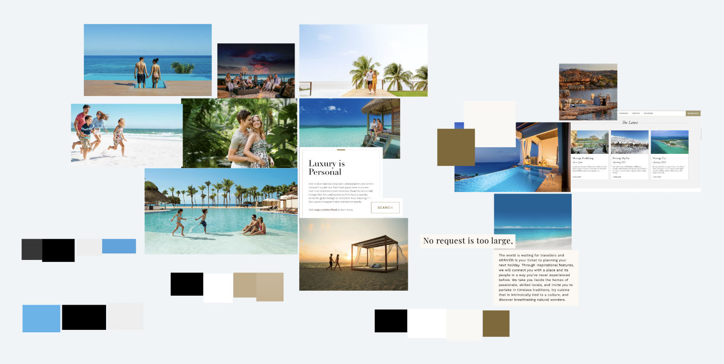
After looking at around 20 websites, I noticed that there were two directions chosen in regards to color.
- Using blues/tropical colors purposefully throughout the site.
- Using neutral-toned colors like light browns, tans, and off whites.
The websites that used neutral toned colors only had color through their use of images. The website was used as a tool to highlight those images, not take the main stage.
In regards to the typography, most of the high end luxury resorts were using a serif font for large type (headings, etc). It makes sense, because generally a serif font is able to portray that “professional” or “luxury” look fairly effectively.
Setting the stage with a style tile
After doing the initial research, and getting a general feel on how this particular area of the industry presents itself, I put together a style tile using shades of blue / tropical colors.
In my opinion the colors weren’t exactly evoking a luxury feel. To make sure, I asked the other students in Slack if this style felt like it belonged to a luxury resort business.
Everyone agreed that this didn’t feel like luxury or high end. So, I went ahead and made another style tile using more neutral colors and sent it off to Slack. The responses were a lot more positive than the first iteration.
Everyone felt like this evoked a more professional and luxury feel than the previous style tile. Allowing the images be the main focus, and letting the website be a medium used to enhance the look and feel of those images.
Round One
Getting into the code
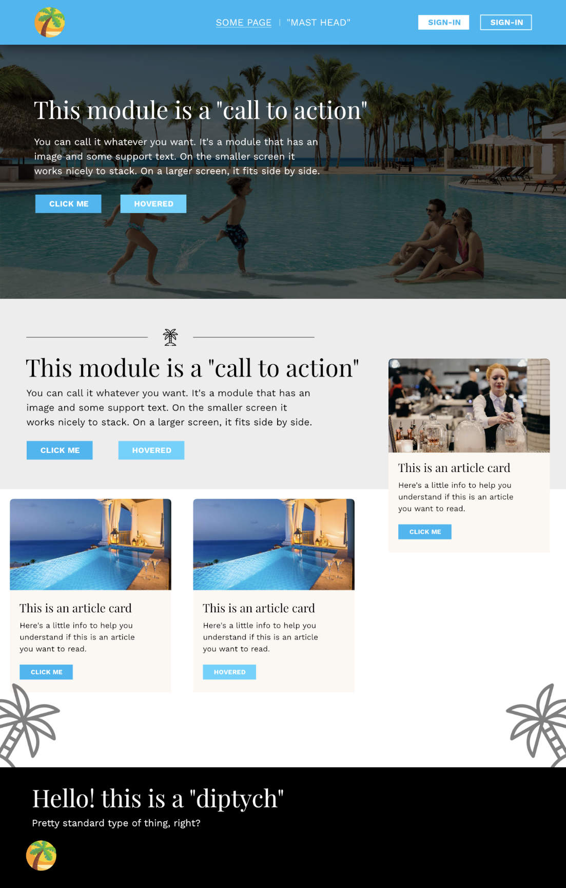
The first iteration was built with just HTML and CSS, and was made with only one theme in mind. Something I’ve noticed is that a design can look nice in a graphics program but not feel so hot on an actual webpage.
I think it has something to do with being able to scale the graphics program window to whatever size you want, but being limited by your browser window on the web.
With that in mind, the goal here was to get the ideas from the styletile onto the web as fast as possible in order to see what works, what doesn’t work, and get a more hands on feel with the design.
Here’s that attempt: https://peprojects.dev/alpha-3/bdlowery/projects/layout-paradise/
User Testing
I wanted to see how people used the site, so I showed it to a couple people in real life and came up with three simple questions to ask
- Can you tell what industry this website is for?
- Does it feel luxury / high end?
- What did you feel about the layout, and hierarchy of content?
The first two questions received positive responses. Everyone knew the industry, and everyone thought that it felt like it was specifically for a high end resort.
But, this initial phase pointed out some glaring issues. For one, the site-menu bar was too thick. Most people viewing the website were doing so on their laptop screen, so you have to imagine how much screen real estate the end user will have available to them.
Here’s a rough example of how much availability a normal user might have:
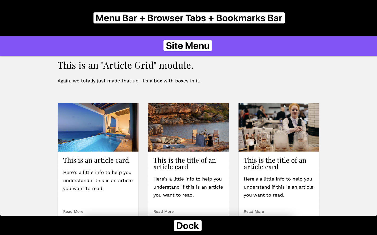
You can see that the site menu is taking up far too much of the screen. This is something I would have never realized because I like to my keep my MacBook pretty barebones; my dock is hidden and I don’t use the bookmarks bar.
Another common complaint (very, very, very helpful complaint) was the hierarchy inside the article cards module.
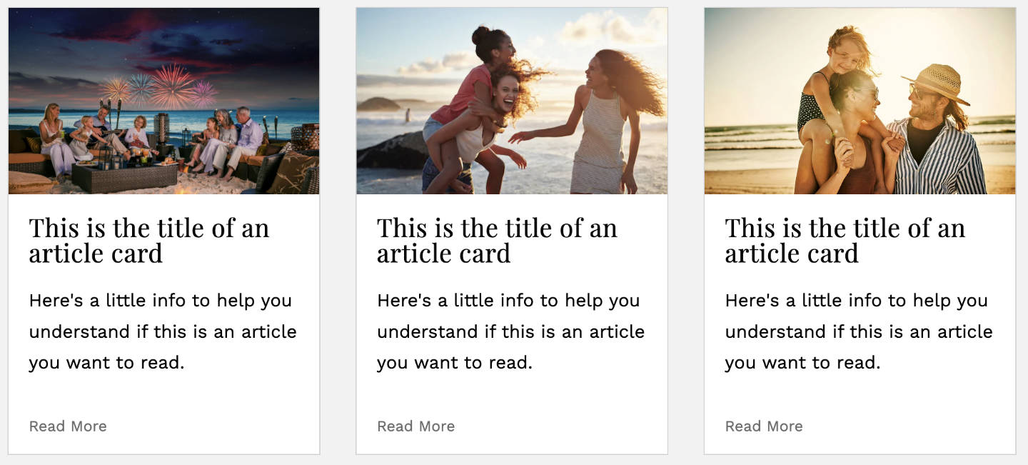
Taking a closer look:
- The heading and paragraph are the same color
- The line-height of the heading is too small
- Paragraph font size is too big.
- Spacing between the image, heading, and paragraph feels “off”.
Round Two
Applying the feedback
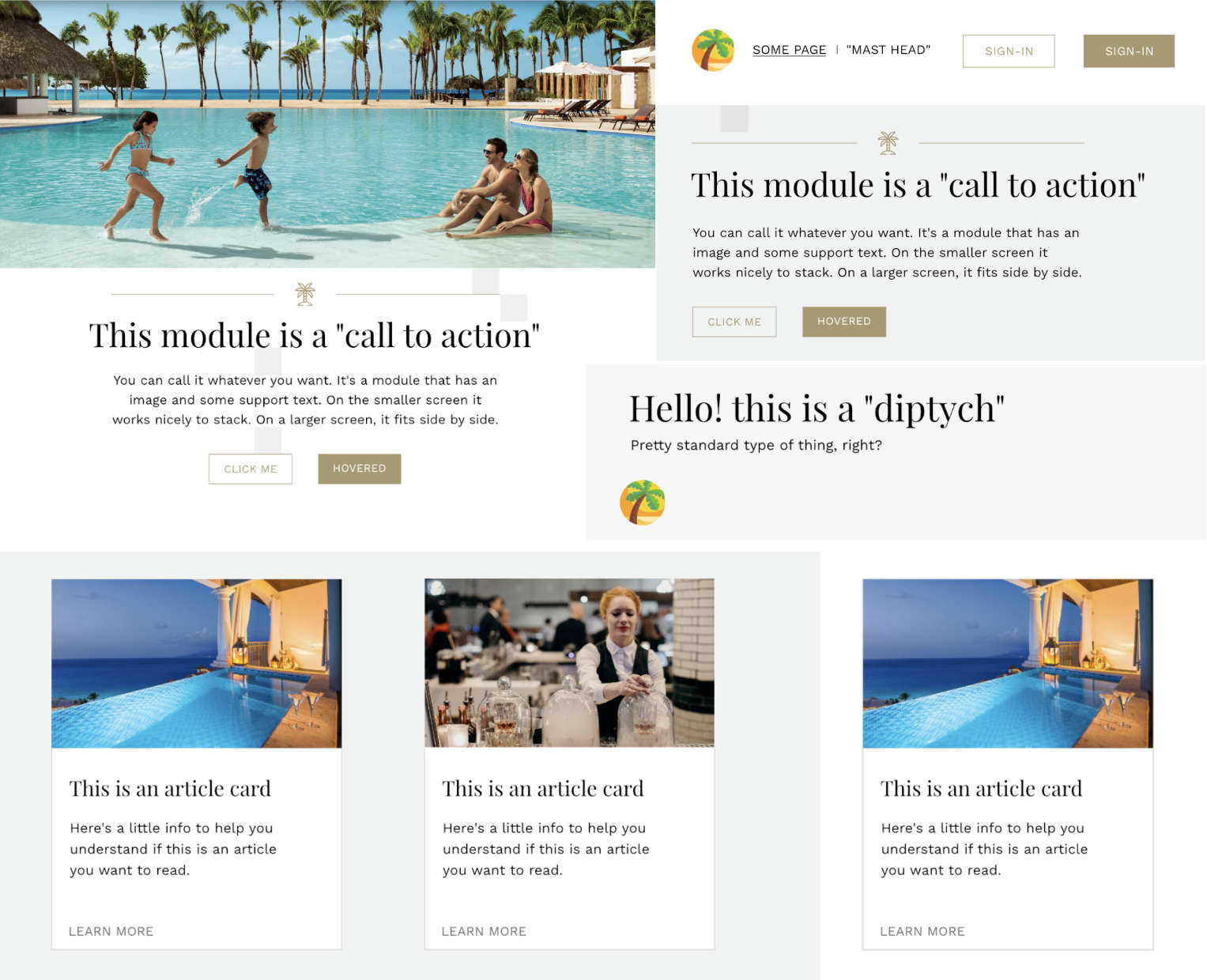
This was the second iteration of the project, taking into account the feedback given: https://peprojects.dev/alpha-3/bdlowery/projects/layout-paradise-v2/
Site Menu
Before / After:
The important takeaway here is to think about the average user. Is the average user going to modify the default dock size and try to make their browser window as minimal as possible? Probably not.
So, if there’s one thing I’ve learned from this is that you shouldn’t make your site menu overly thick, especially if the menu is going to stick with the user through the entire page.
Hierarchy
Call to action section before / after:
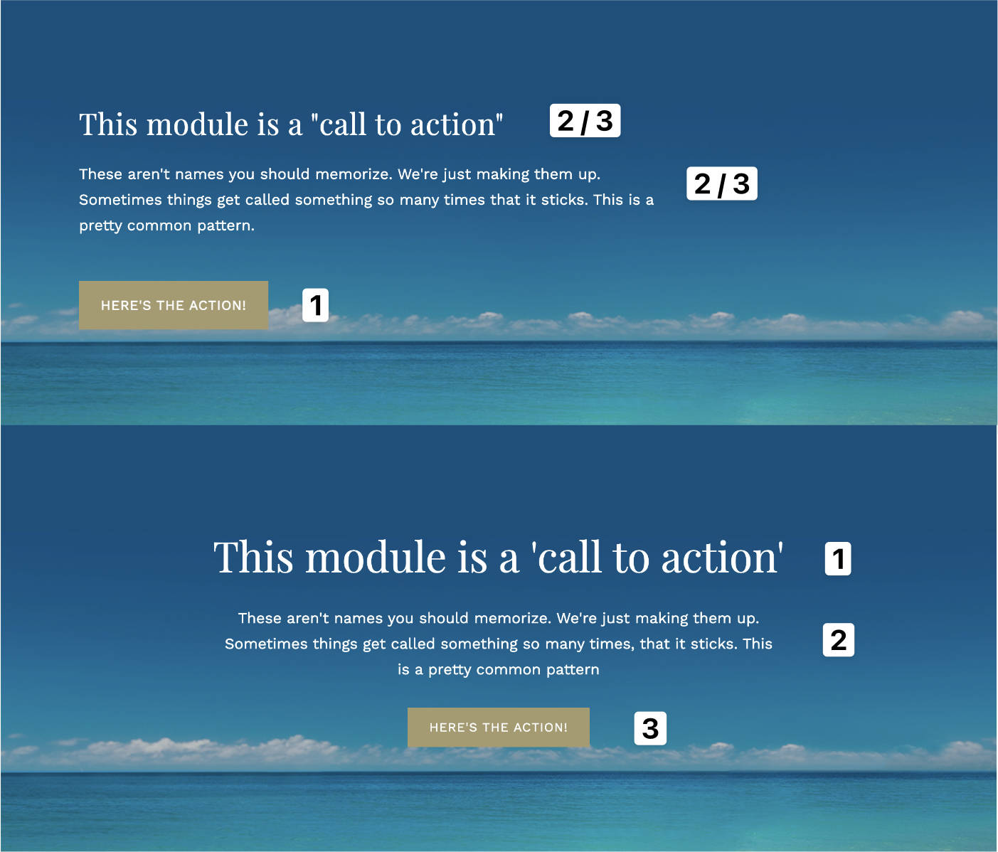
There was a lot wrong with the first iteration of the call to action section.
First, the heading font size was only slightly bigger than the paragraph font size. The heading, especially if it’s the first thing the user will see in that particular section, needs to be an order of magnitude bigger than the paragraphs below it.
Second, in the before photo you can see why it didn’t “feel” right. The button was commanding the most attention, and then the user didn’t know where to look next because the paragraph and heading where so similar.
In the after photo you can see how just making 2 slight adjustments to the heading and button size can change the entire hierarchy of a section.
Article card before / after:
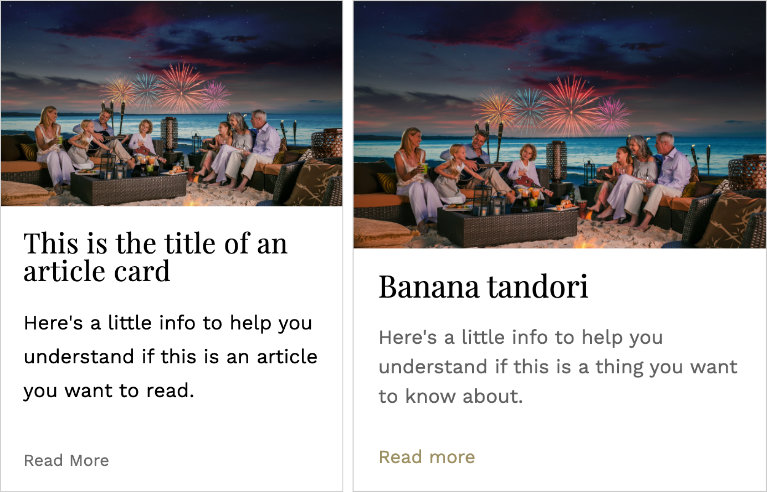
For this iteration I increased the card width. As I said before the website was supposed to complement the images. The first thing a user should see is the image and then the text inside of the card.
Then, I increased the lightness of the black font so it wasn’t competing with the heading.
Finally, I made all of the links inside of the card match with the button-like links. Instead of everything being a giant blob of black text, your eyes can easily latch onto things. There is a clear sense of hierarchy.
Footer before / after:
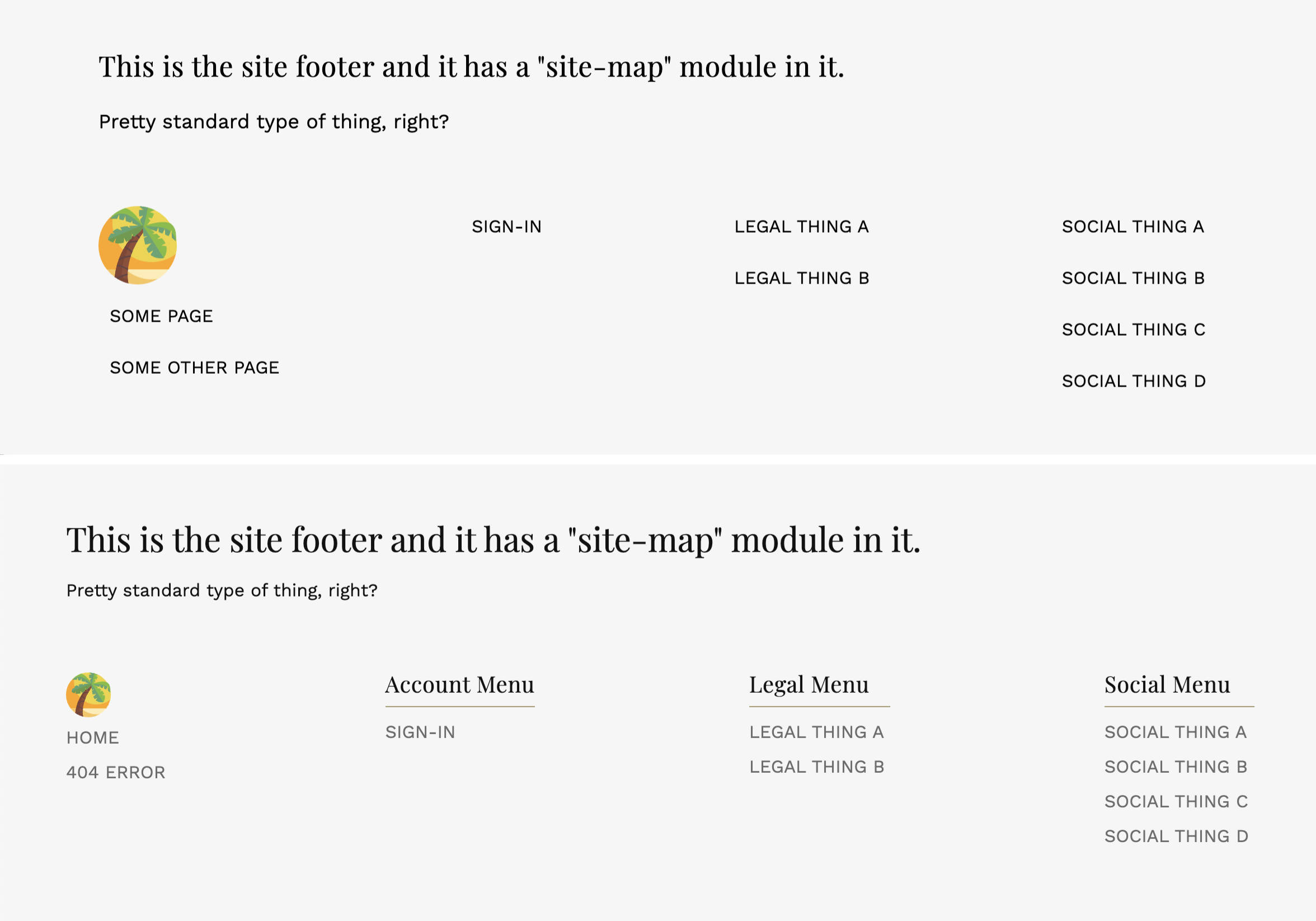
For the footer, I increased the heading size as it was too similar to the intro paragraph closer to the heading, add “sections” to each group of links, and increased the lightness of the links so there was a clear distinction between their headings.
Key takeaway
Small details like Hierarchy aren’t readily apparent to an everyday user. They’ll just think the site “looks bad” if the hierarchy is off. But, if your site has an excellent and consistent hierarchy it’ll set your site apart from the rest.
I think this is the key detail that really gives off the luxury high end look.
Round Three
With all of the styles in place and the hierarchy sorted out I implemented a theme switcher with PHP. The main theme is based on a family resort, and the second theme is an adults only / couples only resort.
Setting up the themes
The whole system is using query strings. The two main navigation links, “Family” and “Couples” insert a query string theme with the parameter of either family or couple into the url.
<a href='?theme=family'>
     <span>Family</span>
   </a>

   <a href='?theme=couple'>
     Couples</span>
   </a>
I then grab the value of the query string parameter and set it equal to a $theme variable
<?php $theme = $_GET["theme"];In this case `$theme` will only ever be equal to family or couple.
I need to use the value stored inside of the `$theme` variable to set a unique theme based on if the `$theme` is family or couple.
<body class="
<?php
   if ($theme === "family" || $theme === "couple") {
     echo $theme;
   } else {
     echo "default";
   }
?>">
I’m making a class on the body and setting it equal to either family or couple. If someone changes the url to something like `?theme=navigation` they could mess up the styles on the entire site. To prevent this I echo out the word `default` if the theme isn’t family or couple.
Changing the data
All of the data (except for the site menu and footer) is generated through a PHP associative array.
There’s 2 things that need to change based on what theme is chosen.
- The call to action images and copy
- The article cards images and copy
Here’s an example of how the call to action sections data is stored.
$ctaFamily = [
  [
   "heading" => "A Family Voyage",
   "copy" => "Spend endless days exploring and celebrating with family and friends over long shared meals. Your sense of wonder will be rekindled while you follow the lead of your littlest family members.",
   "thumbnail" => "couple-call-to-action-1.jpg",
   "action" => "Learn More",
  ],
  [
   "heading" => "Unique Experiences Await",
   "copy" => "We are devoted to delivering an elevated guest experience. Guests can expect impeccable hospitality, world class spas and an elegant yet welcoming ambiance with the goal of creating lasting and cherished memories.",
   "thumbnail" => "couple-call-to-action-2.jpg",
   "action" => "Explore",
  ],
];
The article cards follow the same format.
Inside the HTML all I’m doing is manually selecting which index of the array I want to work with. Looking back I could have used a forEach loop to dynamically generate both call to action sections.
<?php if ($theme === "couple") {
  $ctaCoupleThumbnail = $ctaCouple[1]["thumbnail"];
  $ctaCoupleHeading = $ctaCouple[1]["heading"];
  $ctaCoupleCopy = $ctaCouple[1]["copy"];
  $ctaCoupleAction = $ctaCouple[1]["action"];

  echo "<section class='help-us'>";
  } else {
    $ctaFamilyHeading = $ctaFamily[1]["heading"];
    $ctaFamilyCopy = $ctaFamily[1]["copy"];
    $ctaFamilyAction = $ctaFamily[1]["action"];
    echo "<section class='help-us' style='background-image: url(images/family-call-to-action.jpg);'>";
} ?>

<inner-column>

<?php include('modules/call-to-action.php'); ?>

</inner-column>
</section>
I’m checking to see if the $theme is equal to couple or equal to family, and setting the variables based on that. Then, I’m including the call-to-action module.
Inside of the call-to-action module I want to show a different set of data if the $theme is equal to couple. If it is, I’ll echo out its specific data.
<call-to-action>

<?php if ($theme === "couple") { ?>
 <div class='text-content'>
   <h2 class='loud-voice'><?php echo $ctaCoupleHeading; ?></h2>

   <p class='calm-voice'><?php echo $ctaCoupleCopy; ?></p>

   <a href='#'>
     <span class='button'><?php echo $ctaCoupleAction; ?></span>
   </a>
 </div>
 <picture>
   <img src='images/<?php echo $ctaCoupleThumbnail; ?>' alt='$todo'>
 </picture>
If the theme isn’t couple, I want it to use the default (in this case it’s the family theme)
<?php } else { ?>
 <div class='text-content'>
   <h2 class='loud-voice'><?php echo $ctaFamilyHeading; ?></h2>

   <p class='calm-voice'><?php echo $ctaFamilyCopy ?></p>

   <a href='#'>
     <span class='button'><?php echo $ctaFamilyAction ?></span>
   </a>
</div>
<?php } ?>

</call-to-action>
There’s another call to action section down the page, so I reset the variables to empty strings and reassign them later to the next index in the associative array.
<?php
 $ctaCoupleThumbnail = "";
 $ctaCoupleHeading = "";
 $ctaCoupleCopy = "";
 $ctaFamilyHeading = "";
 $ctaFamilyCopy = "";
 $ctaCoupleAction = "";
 $ctaFamilyAction = "";
?>
With what I know now this probably isn’t the way I would do this as assigning indexes manually to variables won’t scale. But, I learned a lot and had a lot of breakthroughs in my PHP understanding in the week long sprint.
Conclusion
Before completing this project and going through the entire research and design process I could tell when a design “looked pro” but I couldn’t tell you why.
After iterating through 3 versions of this project, and really diving into the details, I understand that the last 10% of details are what really make a website look pro. The typography, spacing, and hierarchy are what make or break a website.
If any of those are not given special attention the entire design wont flow well together and you’ll get that “this doesn’t look right to me” feeling.